MUI Core /Base UI
A blank canvas for
total flexibility
Base UI gives you a set of foundational "headless" components that you can build with using any styling solution you choose—no need to override any default style engine or theme.
Why Base UI
Essential building blocks
for sleek and accessible UIs
Base UI abstracts away the more frustrating aspects of UI development—like accessibility, cross-browser compatibility, and event handling—so you can skip ahead to design implementation.
Alternative to libraries such as:
Unstyled components
Choose your own
CSS adventure
Base UI's skeletal components give you a sturdy foundation to apply custom styles with ease. With no defaults to override, you're free to start from scratch using vanilla CSS, Tailwind CSS, MUI System, or any other framework you prefer.
import { TabsUnstyled } from '@mui/base/Tabs';
import { TabsListUnstyled } from '@mui/base/TabsList';
import { TabPanelUnstyled } from '@mui/base/TabPanel';
import { TabUnstyled } from '@mui/base/Tab';
import { styled } from '@mui/system';

const StyledTabsList = styled('div')`
  min-width: 300px;
  background-color: var(--palette-primary);
  border-radius: 12px;
  margin-bottom: 16px;
  display: flex;
  align-items: center;
  justify-content: center;
  align-content: space-between;
  box-shadow: var(--shadow);
`;

const StyledTabPanel = styled('div')`
  width: 100%;
  font-family: 'IBM Plex Sans', sans-serif;
  font-size: 0.875rem;
`;

const StyledTab = styled('button')`
  font-family: 'IBM Plex Sans', sans-serif;
  color: white;
  cursor: pointer;
  font-size: 0.875rem;
  font-weight: bold;
  background-color: transparent;
  width: 100%;
  padding: 12px;
  margin: 6px 6px;
  border: none;
  border-radius: 7px;
  display: flex;
  justify-content: center;

  &:hover {
    background-color: var(--palette-primary-light);
  }

  &:focus-visible {
    color: #FFF;
    outline: 3px solid var(--focus-ring);
  }

  &.Mui-selected {
    background-color: #FFF;
    color: var(--palette-primary);
  }
`;

<TabsUnstyled selectionFollowsFocus defaultValue={0}>
  <TabsListUnstyled slots={{ root: StyledTabsList }}>
    <TabUnstyled slots={{ root: StyledTab }}>One</TabUnstyled>
    <TabUnstyled slots={{ root: StyledTab }}>Two</TabUnstyled>
    <TabUnstyled slots={{ root: StyledTab }}>Three</TabUnstyled>
  </TabsListUnstyled>
  <TabPanelUnstyled slots={{ root: StyledTabPanel }} value={0}>
    First page
  </TabPanelUnstyled>
  <TabPanelUnstyled slots={{ root: StyledTabPanel }} value={1}>
    Second page
  </TabPanelUnstyled>
  <TabPanelUnstyled slots={{ root: StyledTabPanel }} value={2}>
    Third page
  </TabPanelUnstyled>
</TabsUnstyled>Customization
Endless possibilities
with a lightweight API
With Base UI, you have the freedom to decide how much you want to customize a component's structure and style.
import clsx from 'clsx';
import { styled } from '@mui/system';
import { SwitchUnstyled } from '@mui/base/Switch';
import { useSwitch } from '@mui/base/useSwitch';

const StyledSwitchRoot = styled('span')(`
  font-size: 0;
  position: relative;
  display: inline-block;
  width: 40px;
  height: 24px;
  margin: 10px;
  cursor: pointer;
  border-radius: 16px;
  background: #A0AAB4;

  &.Mui-disabled {
    opacity: 0.4;
    cursor: not-allowed;
  }

  &.Mui-checked {
    background: #007FFF;
    & .MuiSwitch-thumb {
      left: 20px;
    }
  }

  &.Mui-focusVisible {
    outline: 2px solid #007FFF;
    outline-offset: 2px;
  }
`);

const StyledSwitchInput = styled('input')`
  cursor: inherit;
  position: absolute;
  width: 100%;
  height: 100%;
  top: 0;
  left: 0;
  opacity: 0;
  z-index: 1;
  margin: 0;
`;

const StyledSwitchThumb = styled('span')`
  display: block;
  width: 16px;
  height: 16px;
  top: 4px;
  left: 4px;
  border-radius: 16px;
  background-color: #FFF;
  position: relative;
  transition-property: all;
  transition-timing-function: cubic-bezier(0.4, 0, 0.2, 1);
  transition-duration: 120ms;

  &.Mui-checked {
    left: 20px;
  }
`;

function SwitchFromHook(props) {
  const {
    getInputProps,
    checked,
    disabled,
    focusVisible,
  } = useSwitch(props);

  const stateClasses = {
    'Mui-checked': checked,
    'Mui-disabled': disabled,
    'Mui-focusVisible': focusVisible,
  };

  return (
    <StyledSwitchRoot className={clsx(stateClasses)}>
      <StyledSwitchThumb className={clsx(stateClasses)} />
      <StyledSwitchInput {...getInputProps()} aria-label="Demo switch" />
    </StyledSwitchRoot>
  );
}

function App() {
  return (
    <SwitchUnstyled
      slots={{
        root: StyledSwitchRoot,
        input: StyledSwitchInput,
        thumb: StyledSwitchThumb,
      }}
      slotProps={{
        input: { 'aria-label': 'Demo switch' },
      }}
    />
    <SwitchFromHook />
  )
}
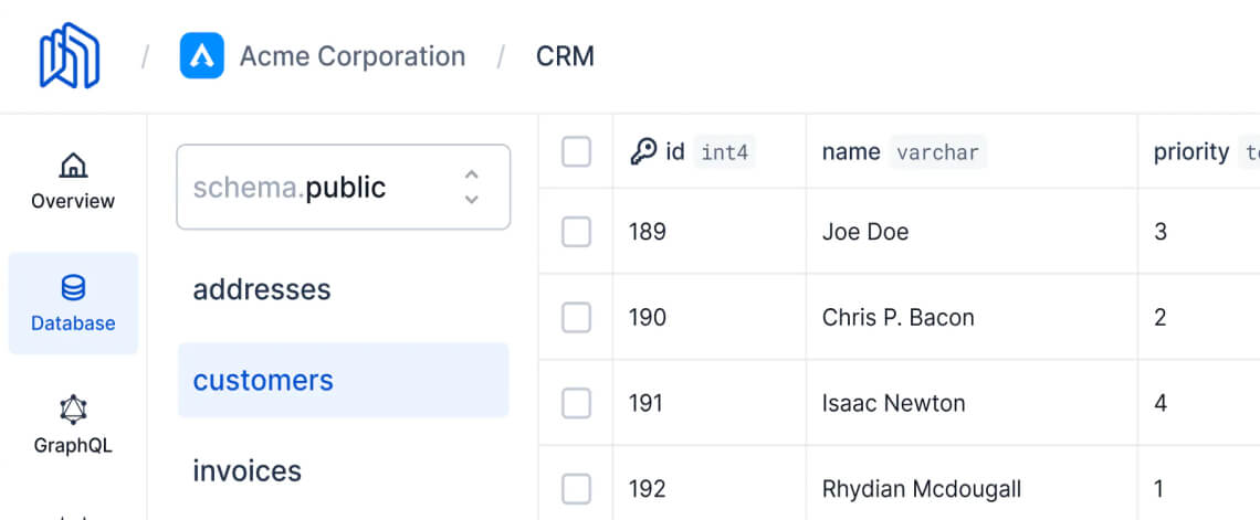
Nhost's dashboard

Nhost's new dashboard, powered by Base UI / View the blog post
“After considering various options, we decided to migrate our custom components to Material UI, and that's when we discovered Base UI. As a set of headless components, it offered exactly what we needed to implement our design system while maintaining full customizability. The focus on accessibility was also a big plus, as it ensured that our dashboard was usable by everyone. Low-level component hooks were just the icing on the cake.”
Szilárd Dóró
Senior Software Engineer

Community
Join our global community
Base UI wouldn't be possible without our global community of contributors. Join us today to get help when you need it, and lend a hand when you can.
Base UI vs. Material UI
Base UI features many of the same components as Material UI, but without the Material Design implementation.
Does it come with styles?
Base UI is not packaged with any default theme or built-in style engine. This makes it a great choice if you need complete control over how your app's CSS is implemented.